TypoRules: 7 Techniques for Effective Readability + Legibility
Typesetting Tips + Techniques
I ♥ typography. There's just so much beauty in letterforms and so much we can do to create content that is enjoyable, easy, and meaningful to engage with.
I studied typography for 4 years in my undergraduate career and have fallen in love with manipulating text, designing with typography, animating type, and studying its history.
Typesetting is very important to me and is essential to master as a designer.
I've written my top 7 guiding points to help beginners establish their proficiency in creating documents, layouts, and designs that are usable, digestible, and elegant. You can apply these concepts to anything that you're producing.
Happy reading!
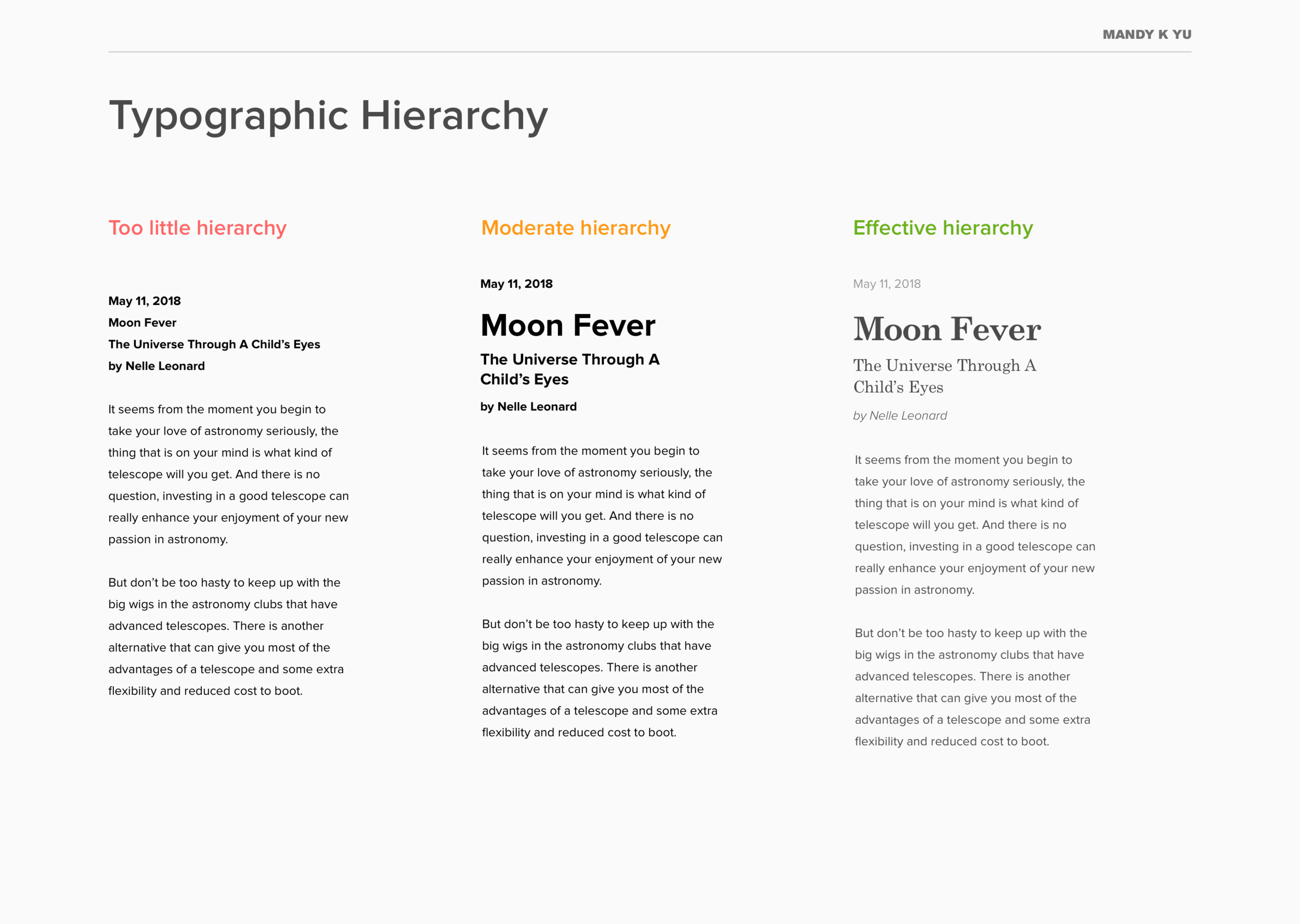
TYPOGRAPHIC HIERARCHY
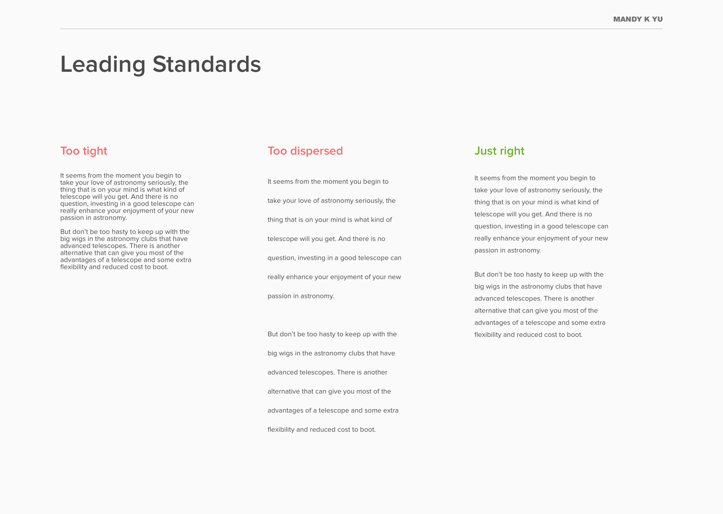
1. Do incorporate typographic hierarchy to emphasize texture, cadence, and importance.
We often times undervalue how we can format text. The smallest refinement can make the biggest difference.
Why? It helps our readers prioritize and present content with focus, direction, and order.
Do: Use other stylistic techniques to create contrast instead, such as:
Weight - Using a different weight or style within the font family (bold, medium, condensed, etc)
Colour - Using a different colour or shade
Scale - Increasing or decreasing the size
Space - Using negative space as padding and to create cadence
Form - Grouping blocks of certain text together
Style - Combining 2 typefaces together for contrast
Try: Reading Typographic Hierarchy by fonts.com
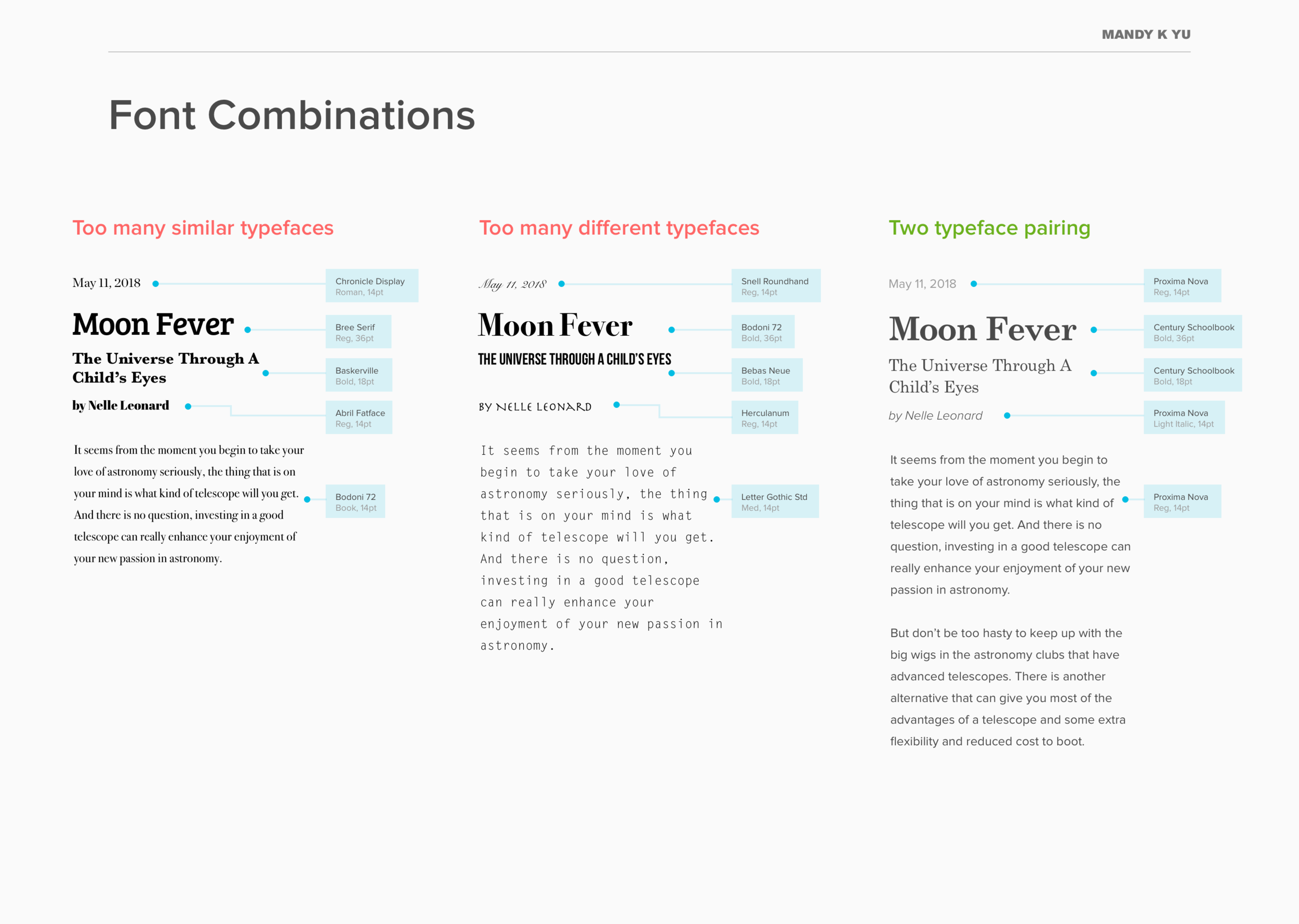
TYPOGRAPHIC CONTRAST
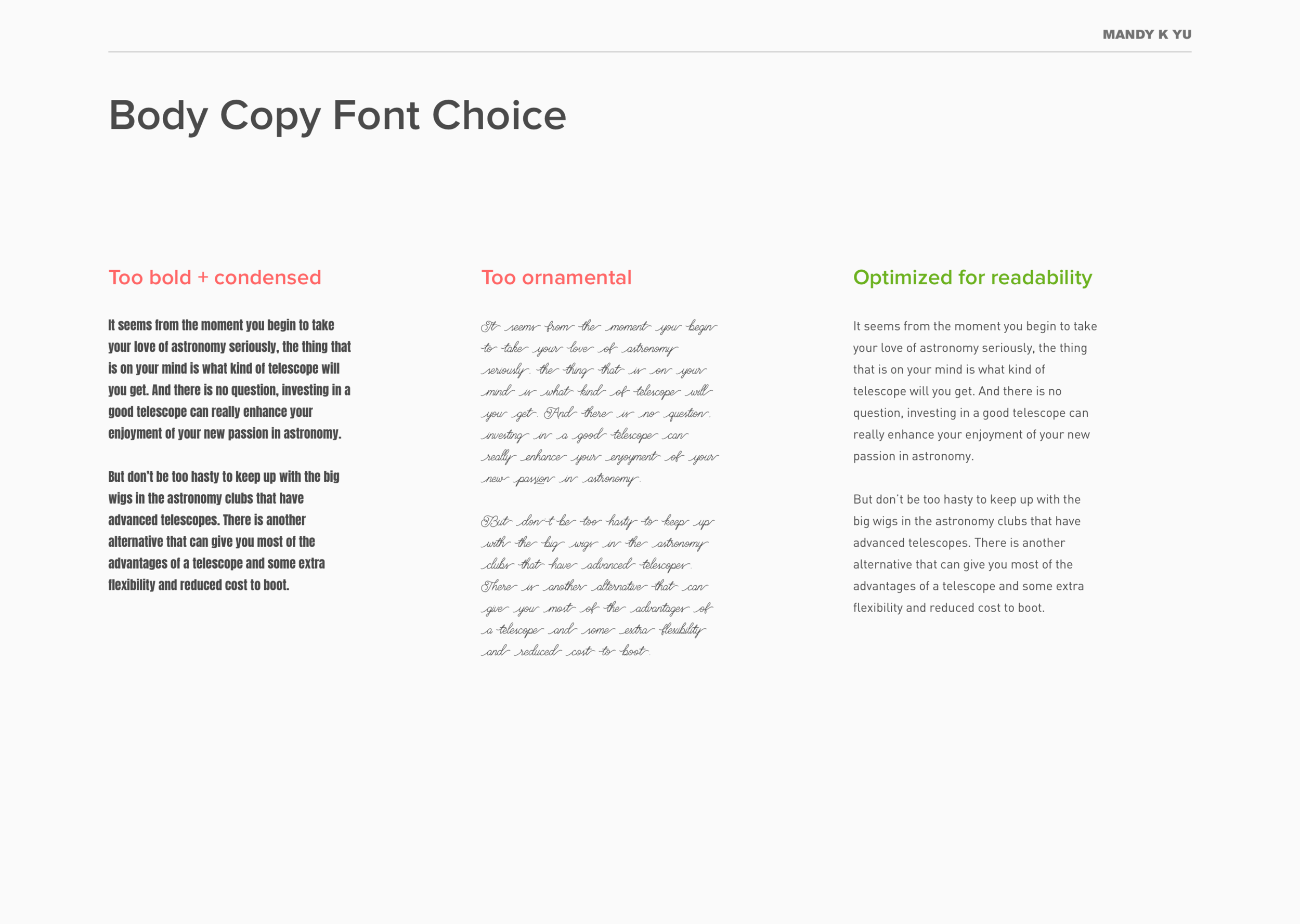
2. Don't mix / combine too many fonts together.
We also tend to "over design". Let your content and your typesetting speak for itself – not the typeface.
Why? You know those motivational posters that have 30 different typefaces for different words slapped together overlaid on top of a scenic or inspirational photo? All typefaces evoke a certain mood. Some are sophisticated and strong, others are round and playful. Some are futuristic and cold, others are soft and friendly. We don't want our designs to look like a mishmash because it can create confusion by mixing these different moods.
Do: Pair 2 contrasting typefaces together harmoniously, such as a serif with a sans-serif. It is suggested to avoid using 3 typefaces or more.*
Try: FontJoy – it helps generate curated font pairings.
Read: 8 Tips for Combining Typefaces by Adobe
*Source: How Many Fonts Is Too Many Fonts? by Engage Interactive
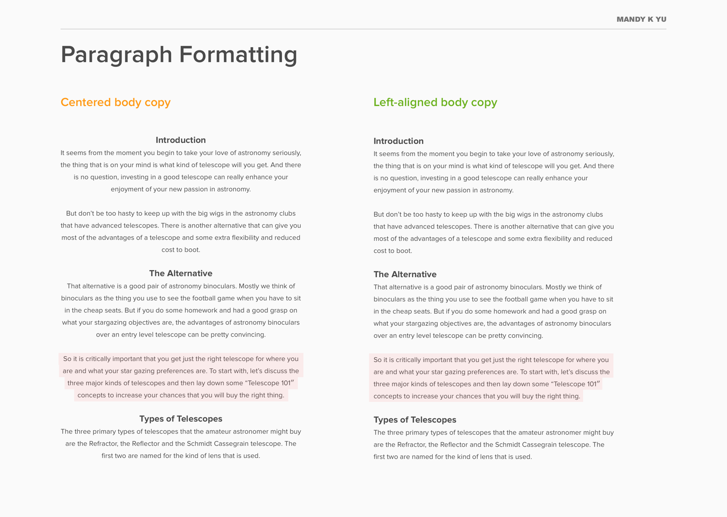
READABILITY + TYPESETTING
3. Don't center everything, especially long text blocks.
Just look at the difference that paragraph formatting can make.

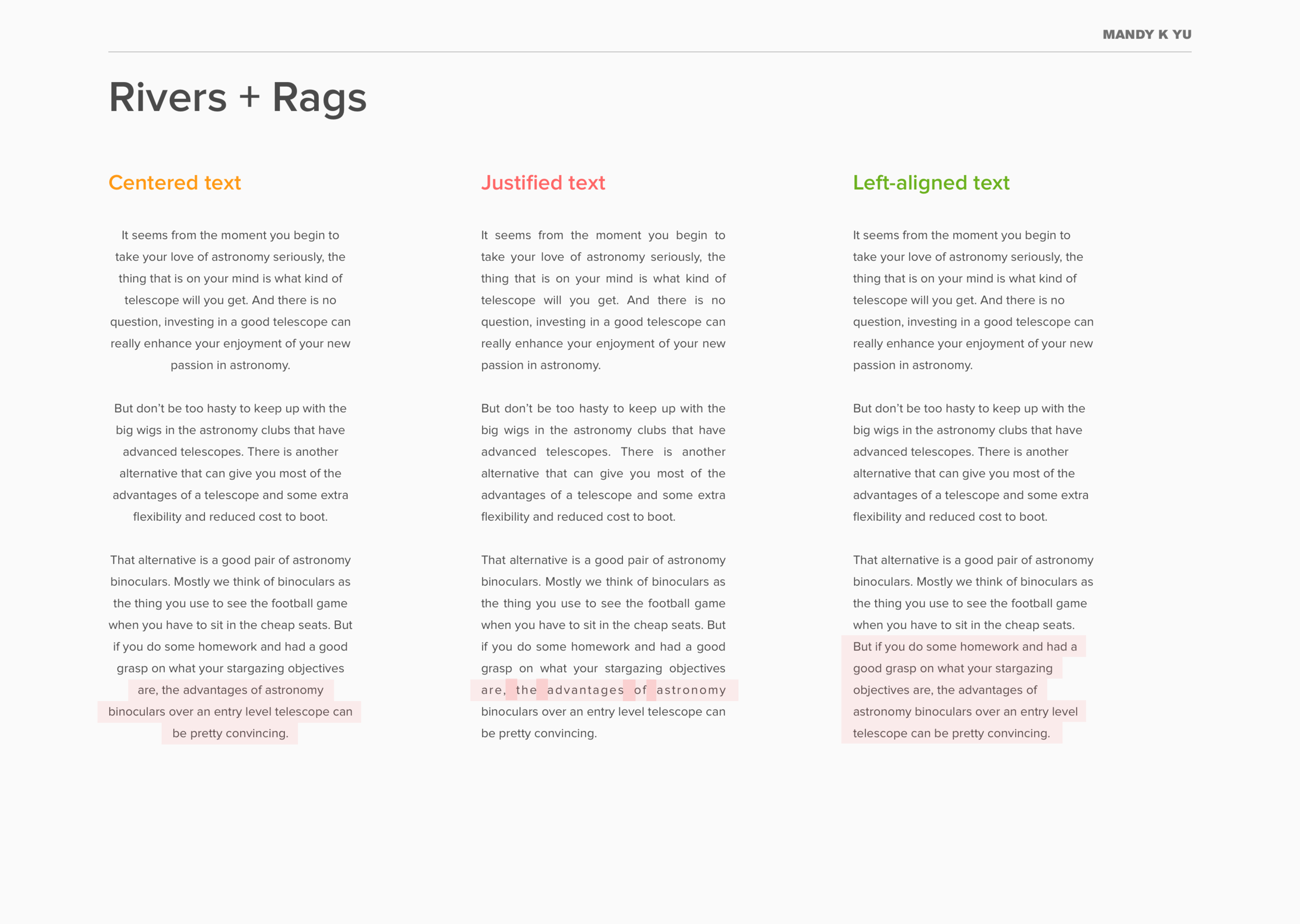
Why? Centering long bodies of text hinders readability by creating an odd shaped rag on both sides of the text block – highlighted in red.
Opt to left-align bodies of text because we read left to right in Latin-based languages. Left-aligned text creates a rags on the right which "allows our eyes to easily judge the distance from the end of one line to the start of the next."
You also want to avoid using justified text – seen in image 2 in the middle example – this is the styling format where letters are pushed out to create modular line lengths. However, they end up creating inconsistently shaped gaps between words.
Do: Left-align long bodies of text to maximize readability.
Do: Center headers or short paragraphs.
*Source: What Makes Good Web Typography by TicToc Digital
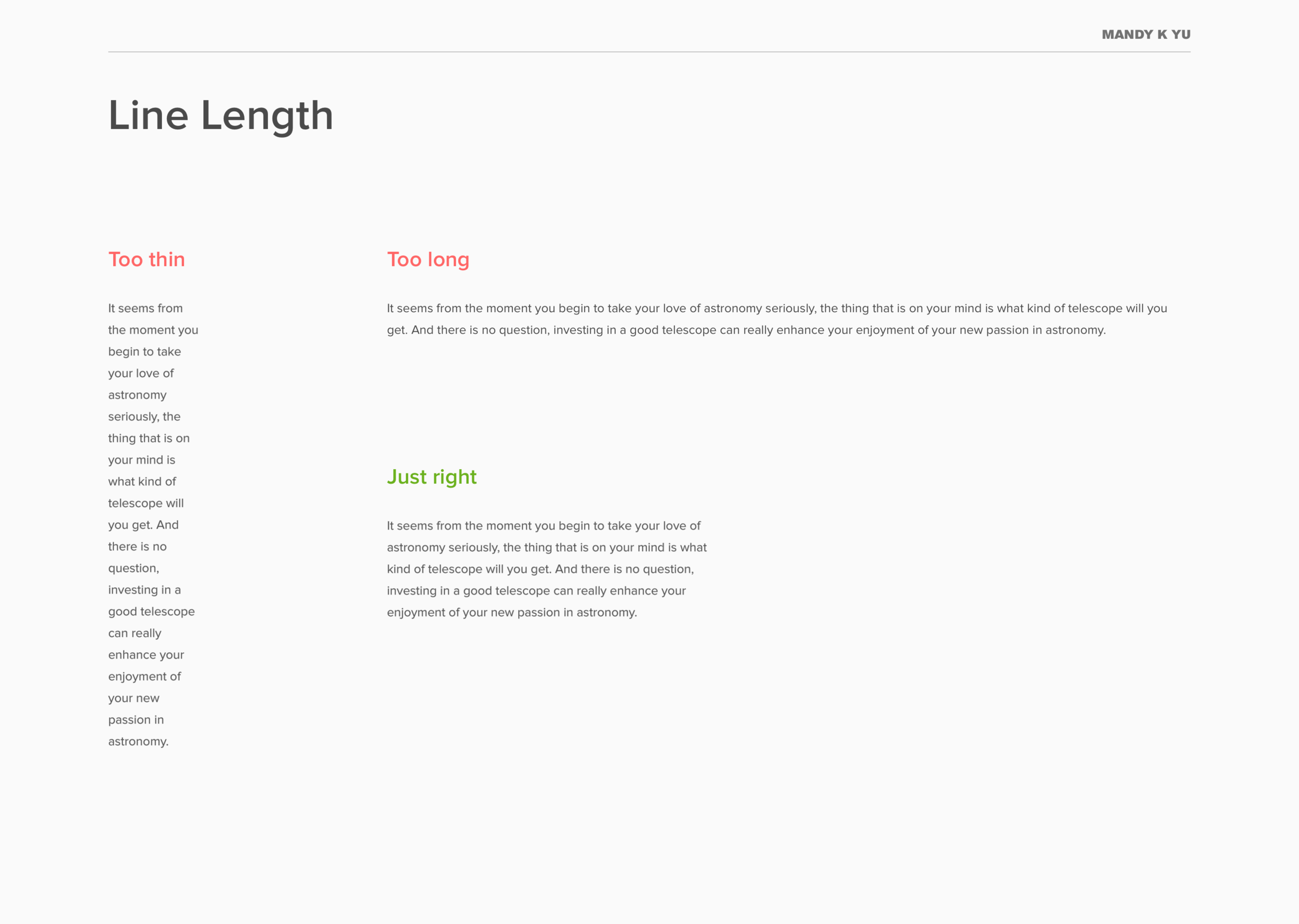
READABILITY + TYPESETTING
4. Don't make your line lengths too short or too long for bodies of text.
Why? Line length that is too short seems disjointed and too stacatto, while line length that is too long reads like a run-on sentence and is tiring for the eyes.
Do: Use line lengths that are comfortable to read. "The optimal line length for your body text is considered to be 50-60 characters per line, including spaces (“Typographie”, E. Ruder). Other sources suggest that up to 75 characters is acceptable."*
*Source: Readability – The Optimal Line Length by The Baymard Institute
READABILITY + TYPESETTING
5. Don't use leading that is too tight or too loose.
Leading:
The vertical space in between lines, also known as line-spacing.
Why? Having lines that are too close together don't allow for breathing room which results in the eye having a hard time finding the start of the next line. On the other end of the spectrum, having leading that is too large begins to break up sentences and creates a disjointed reading experience.
Do: The trick that I use when it comes to leading is – if you are using 14pt size, never use 14pt or lower for leading specs. Luckily, most design softwares can now automatically set your leading to an optimal setting – these numbers will vary depending on the font being used and scale. For example, 14pt sized text that is Proxima Nova in Sketch will automatically set the leading to 17pt. Be aware that leading and text size will need to be adjusted accordingly depending on how the content is being viewed as well – for example, on a mobile phone, on a laptop, etc.
Read: Ellen Lupton's "Thinking with Type" on Line-Spacing
LEGIBILITY + READABILITY
6. Don't use "fancy" fonts [aka display fonts] for body copy.
Display Fonts:
Fonts that are intended for larger headings for "display". They're most commonly decorative and stylistic, as opposed to the more simplistic form of typefaces used for body text.
Why? Using highly ornamental and decorative fonts hinders readability by producing extra cognitive load for readers and excess frills that make it slower to read.
Do: Use notable font families crafted by professional typographers such as:
Open Sans
Proxima Nova
Garamond
Avenir
Baskerville
Gills Sans
Akzidenz Grotesque
Roboto
Helvetica Neue
Do: Use display fonts for short headers or one-liners.
Try: GoogleFonts for an extensive collection of great typefaces.
ACCESSIBILITY + COLOR CONTRAST
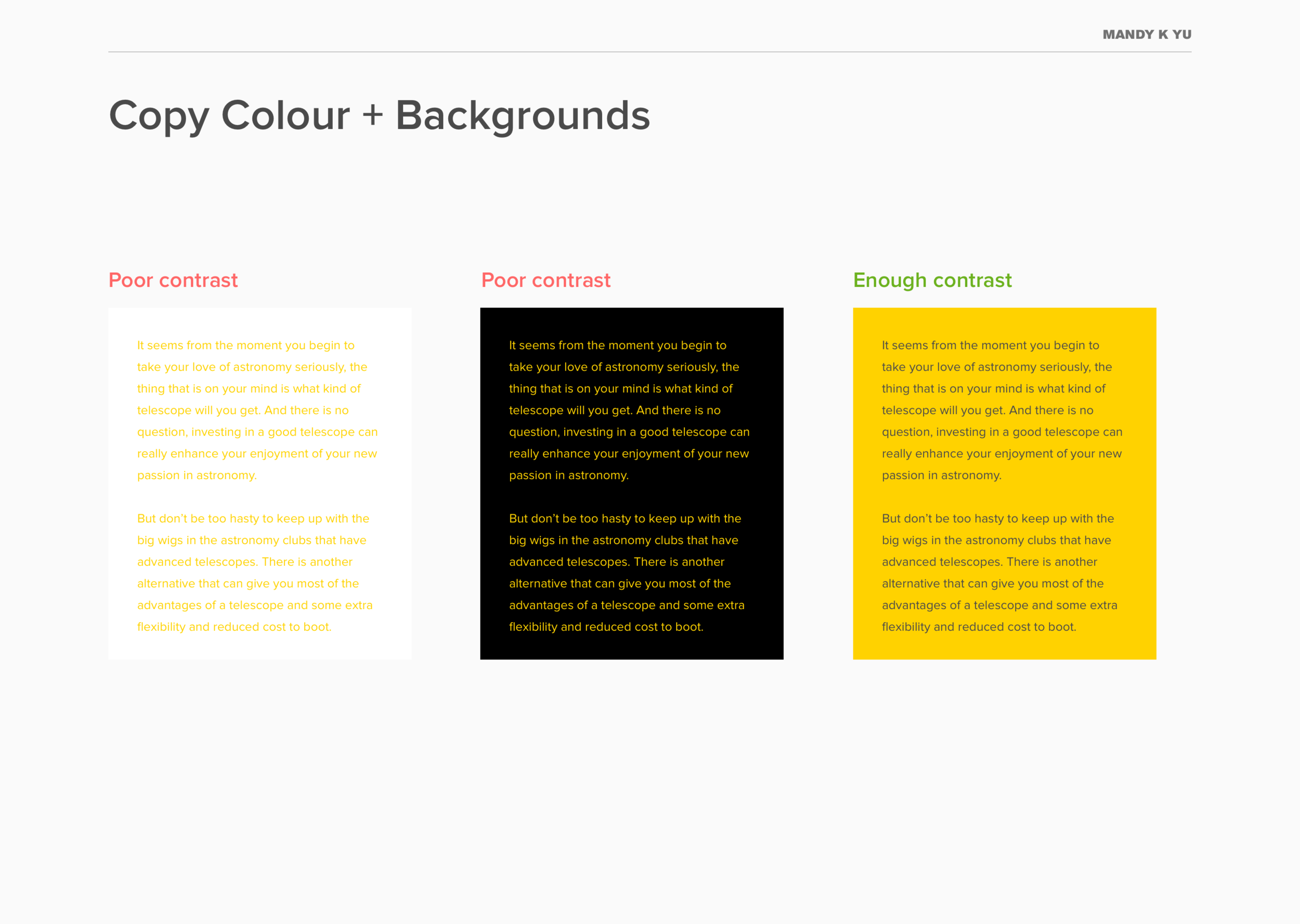
7. Don't use yellow on white backgrounds for body copy.
Accessibility:
The study and practice that involves 2 key issues: how users with disabilities access electronic information and how web content designers and developers enable web pages to function with assistive devices used by individuals with disabilities.*
Source: Adobe Accessibility Primer
Why? It hinders legibility and makes it very hard to make out letterforms. 8% of the male population in the entire world suffer from one type of colour blindness. Under accessibility guidelines, using insufficient colour contrast prevents certain readers who may have some form of colour blindness (Tritanopia, Deuteranopia, achromatopsia, etc) to even make out characters. This is a small facet that is part of accessibility or inclusive design.
Do: Use yellow (or other light colours) as accent features – such as underlines, colour backgrounds, etc.
Try: WCAG's Contrast Checker – it calculates if there is enough contrast of text vs. background.
Source: Facts About Color Blindness by The National Eye Institute
To sum it all up:
A typographic police squad doesn't exist. You probably won't be punished for breaking these guidelines, but they will help your readers digest information in a beautiful and easy manner.
It takes time and practice to get it right. You also need a keen visual eye to be able to distinguish differences between weak vs. strong typesetting.
Take these tips and try them the next time you're putting together a presentation, leaflet, report, or even when preparing your resume.
Summary