

Banking, Reimagined.
Digital Banking in a Digital Age
Industry
Banking & Finance
Client
Equitable Bank
Duration
June - Oct 2016
Role
UX/UI Design Lead
THE CHALLENGE
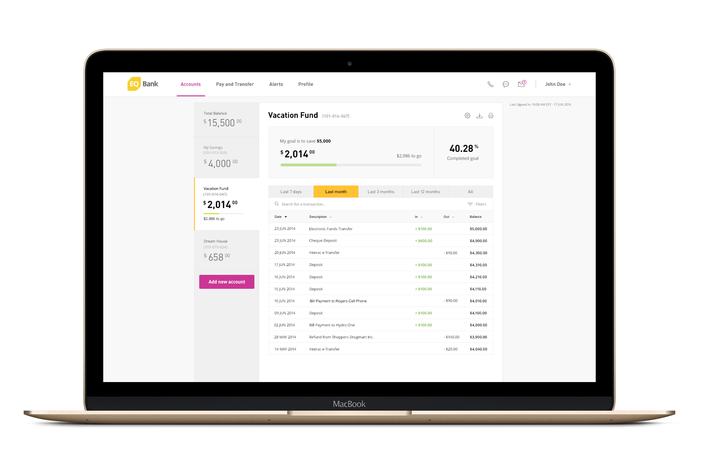
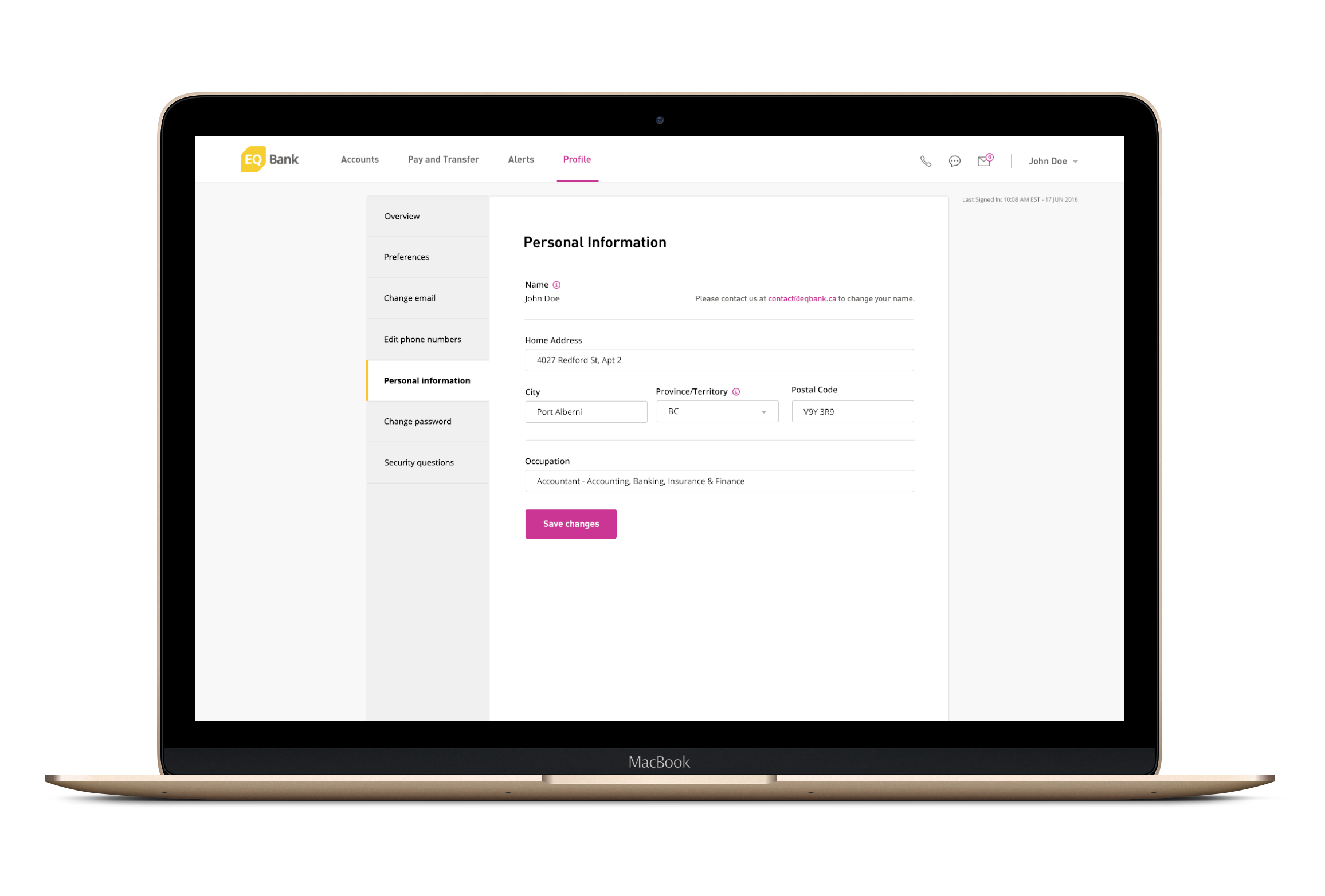
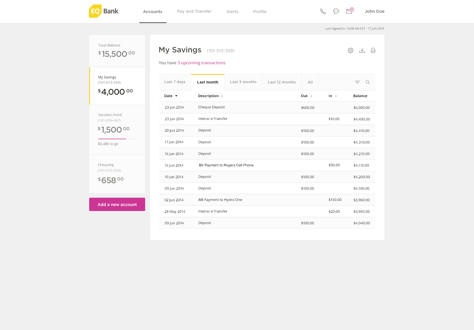
EQ Bank wanted their first product to allow customers to pay bills, transfer money to friends and family, and also earn a competitive interest rate – all from one account.
SOLUTIONS
User Research, UX Audit + Strategy
Digital Brand Identity
Mobile Web App Design + Development
Responsive Marketing Web Design + Development
EQ Bank: Responsive Marketing Website Design + Development
THE CLIENT
Founded in 1970, Equitable Bank is Canada's ninth largest independent bank, with over $17 billion worth of total assets.
They offer a service called EQ Bank, a completely online bank that aims to offer Canadians a different way of banking – one that is simpler and more flexible than ever.
Partnering with the client, we designed and built the EQ Bank web and mobile applications along with the responsive marketing website launching their high interest savings account service.


EQ Bank: Mobile Application Screens
THE USERS
We conducted a Google Consumer Survey of 3 different target demographics of banking customers.
Consumer groups were each asked 10 questions regarding their personal finance and banking habits and preferences. The insights gathered from 2 target group's responses are:
73%
Access online or mobile banking "a few times per month" or more.
56%
Say online banking is one of their bank's most important features.
We have a long-lasting relationship with Equitable Bank, so when they approached us with the request for a full brand and digital refresh, we took it with force.
1. Design Strategy + Audit:
We did a full audit on the user experience and design aesthetic of their applications and asked ourselves what areas we could improve on for the launch of their second release.
THE APPROACH


2. UX/UI Optimization: Through sketches and wireframe, we took this time to propose and break down new concepts and layouts that optimize the functionality and ease of use for app users.

EQ Bank: Mobile App Sketches
EQ Bank: New app features incorporating UI and UX best practices that were added.
3. Client Communications: Along with working with the internal teams, I was responsible for advocating UX best practices – especially during client meetings offsite with our UX consultant leading these conversations.
4. Design Exploration: We explored many options for layout and composition, selected states and tabs, colour and typographic combinations, with an attempt to maintain EQ's existing visual identity and ensure visibility and usability for our users.


5. Creative Review: Working closely with the web development team and with the mobile app development team, we ran through many rounds of quality assurance through creative reviews to ensure that what we had designed was built with accuracy and could run smoothly on multiple platforms.
The team at EQ Bank had an existing visual identity they wanted to maintain – especially with their yellow, pink, and grey palette. The client also preferred DIN as a typographic style they wanted to include, and discontinue using a serif type.
CONSTRAINTS

EQ Bank: Raspberry and yellow are their primary colours in their system

EQ Bank: DIN is their primary font used in their visual identity
THE IMPACT
The EQ Bank web and mobile applications were released to the public in early 2016. Since the release of the bank, along with the applications, has experienced incredible growth in adoption and usage.
Additional Artefacts
Before hand off to the development team to build out, we crafted a UI kit with interface components and blocks that would be required across all screens.
Team Members
Special thanks to everyone from both the Konrad Group and EQ Bank teams who played a key role in this project: